THE DEN 2026 — Brand Identity & Visual System
A bold, character-driven brand identity for a private training studio, transforming a personal passion for lions into a distinctive visual language built around strength, movement, and individuality.
Overview: THE DEN is an intimate, independently owned training studio founded by Sonan Al Shalabi. Designed as a dedicated space for strength, conditioning, and personal training, the studio offers a more focused and personal alternative to the conventional gym environment.
The name THE DEN draws inspiration from Sonan's fascination with lions, reflecting the idea of a personal territory—a space defined by strength, confidence, and belonging.
The creative direction translated this inspiration into a contemporary fitness identity, moving away from the aggressive, overly masculine visual conventions often associated with gym branding. Instead, the objective was to create something bold, confident, and full of character, while remaining approachable, versatile, and visually refined.
My role: Brand Identity & Visual Designer — responsible for creative direction, logo development, brand identity, and the visual system across digital and physical applications.
Scope & Contribution: I developed THE DEN's visual identity from its central concept, translating the owner's personal connection to lions into a distinctive brand symbol.
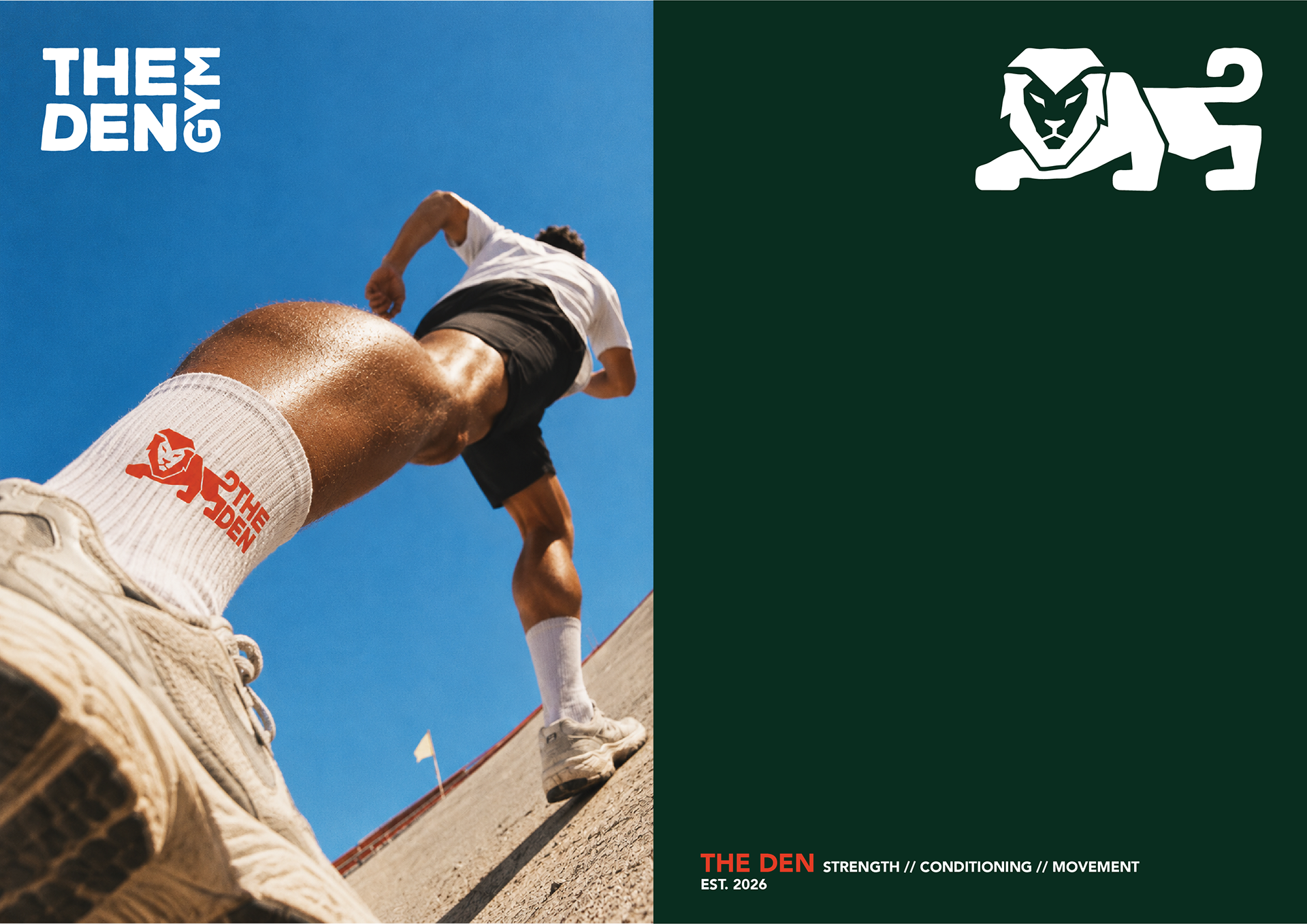
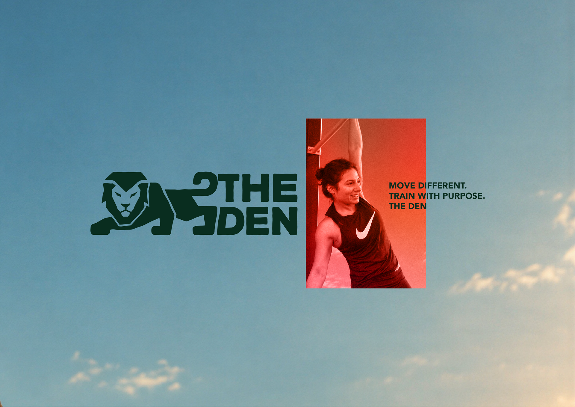
At the heart of the identity is a custom lion mark, illustrated in a low, crouching position to communicate controlled power, readiness, and movement. Its simplified, geometric construction creates a recognizable silhouette that feels both athletic and contemporary.
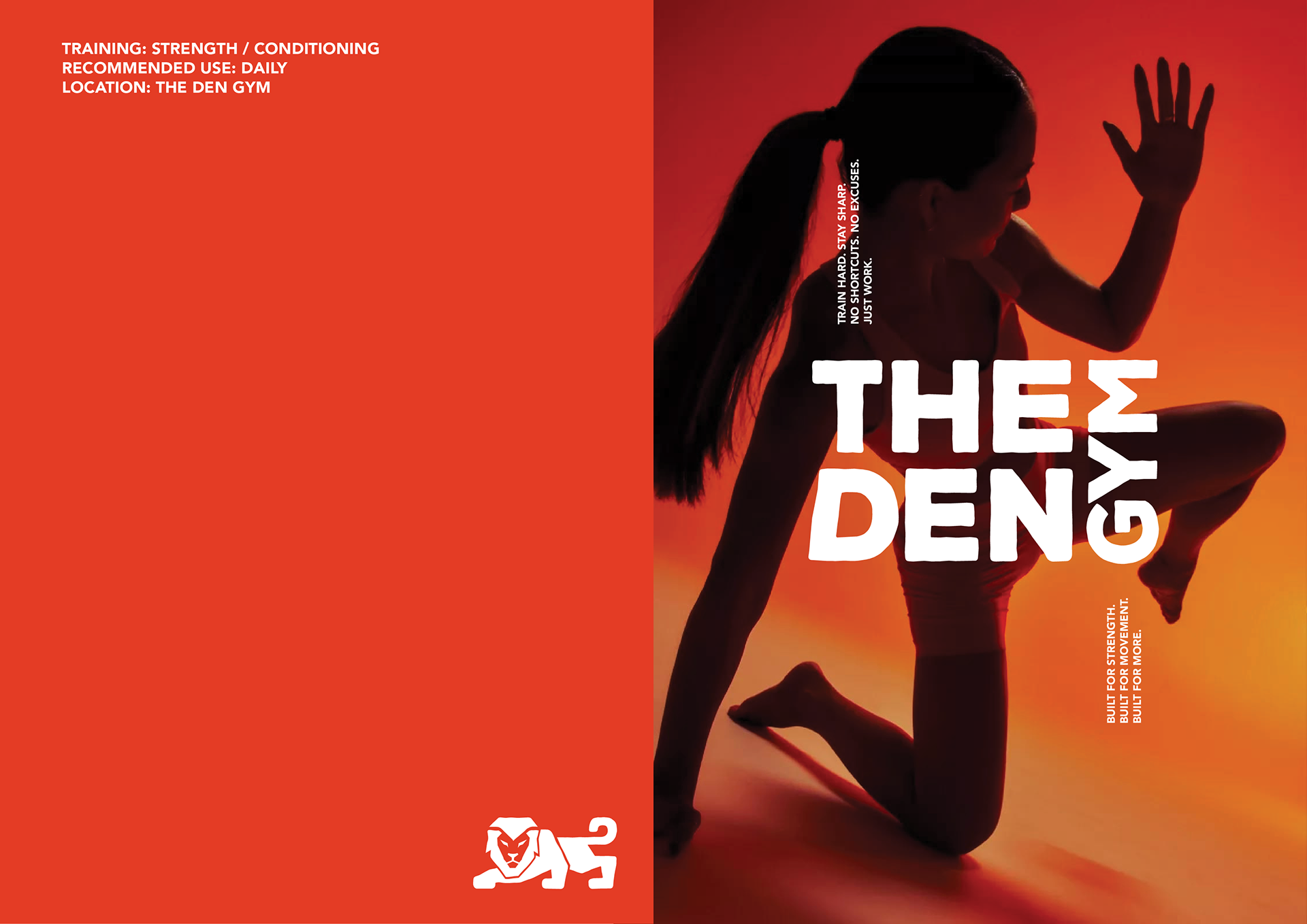
The lion is paired with a bold, compact typographic treatment, creating a unified identity that balances character with clarity. The visual system introduces a deep forest green, vibrant orange-red, and clean white, establishing a strong visual contrast that feels energetic without relying on traditional fitness aesthetics.
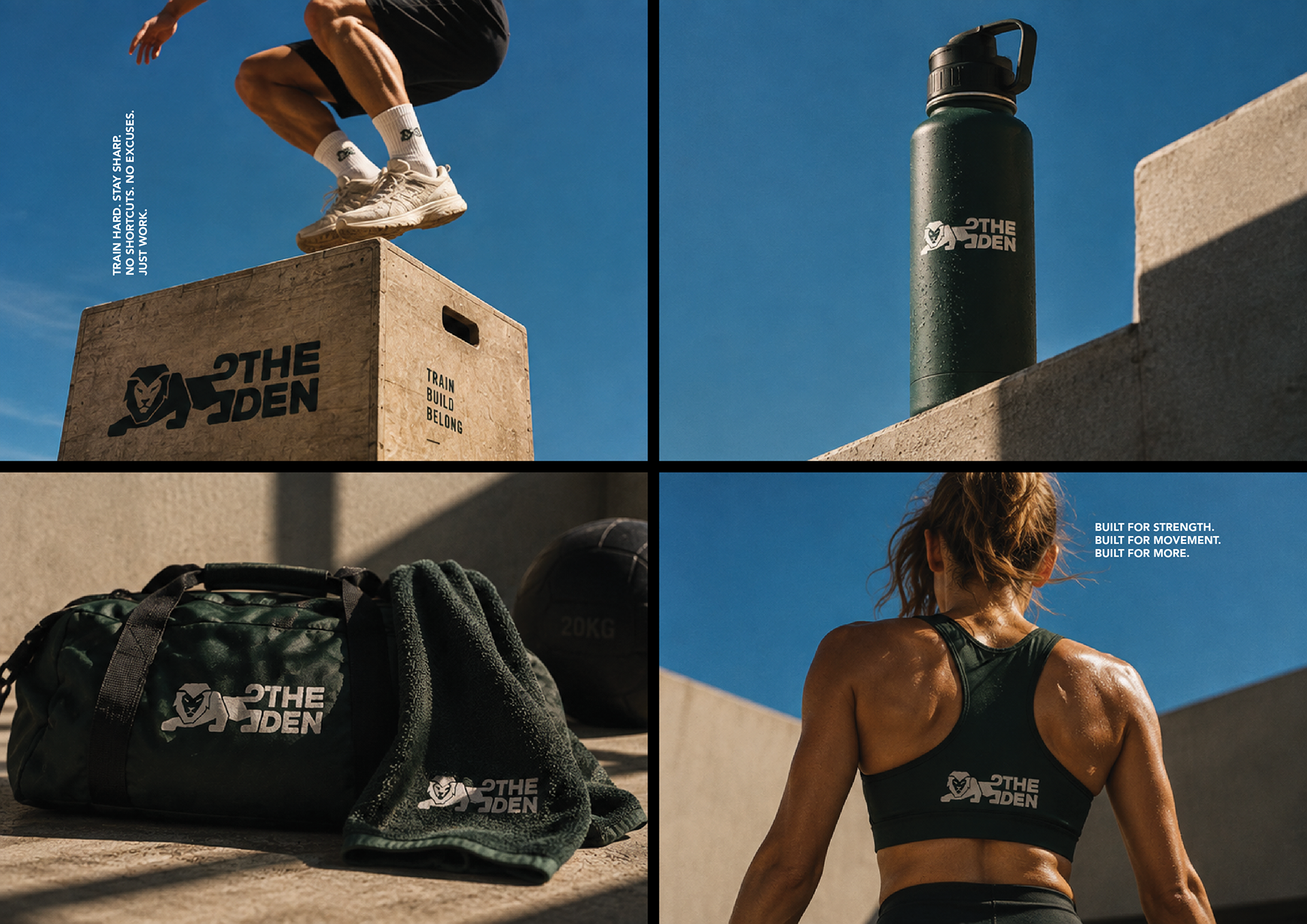
Beyond the primary logo, I explored the identity across apparel, training accessories, environmental applications, and campaign-led imagery. Dynamic photography, expressive compositions, and confident typography extend the brand beyond the studio itself, creating a flexible visual language with its own personality.
Challenge: The primary challenge was creating a lion-inspired fitness identity without falling into familiar visual clichés—aggressive animal illustrations, bodybuilding aesthetics, or overly complicated emblems.
The identity needed to communicate strength without intimidation and feel premium without becoming overly polished or corporate.
Equally important was ensuring that the brand could function at different scales, from a small logo on training apparel to larger environmental graphics and digital campaigns, while maintaining its distinctive character and visual impact.
Deliverables: Brand strategy and creative direction, custom logo design, visual identity system, typography and color palette, logo variations, branded apparel concepts, training accessories, environmental branding applications, and digital campaign visuals.
Outcome: THE DEN's identity establishes a distinctive visual foundation for a private training studio, transforming a personal inspiration into a recognizable and adaptable brand.
The crouching lion becomes more than a symbol of strength; it gives the studio a personality of its own. Combined with bold typography, a restrained color palette, and movement-led photography, the system creates a consistent visual presence across physical and digital touchpoints.
The result is a confident, contemporary fitness brand that feels personal rather than institutional, expressive rather than aggressive, and designed to grow beyond its original space.
Building a brand with character? Let's talk — I create distinctive identities and visual systems that turn ideas into memorable brand experiences.