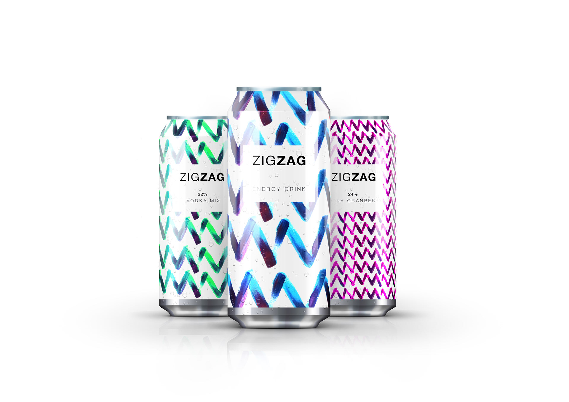
Zigzag — Packaging Design
A bold, hand-painted packaging concept that brought vibrant energy and artisanal flair to an alcoholic energy drink.
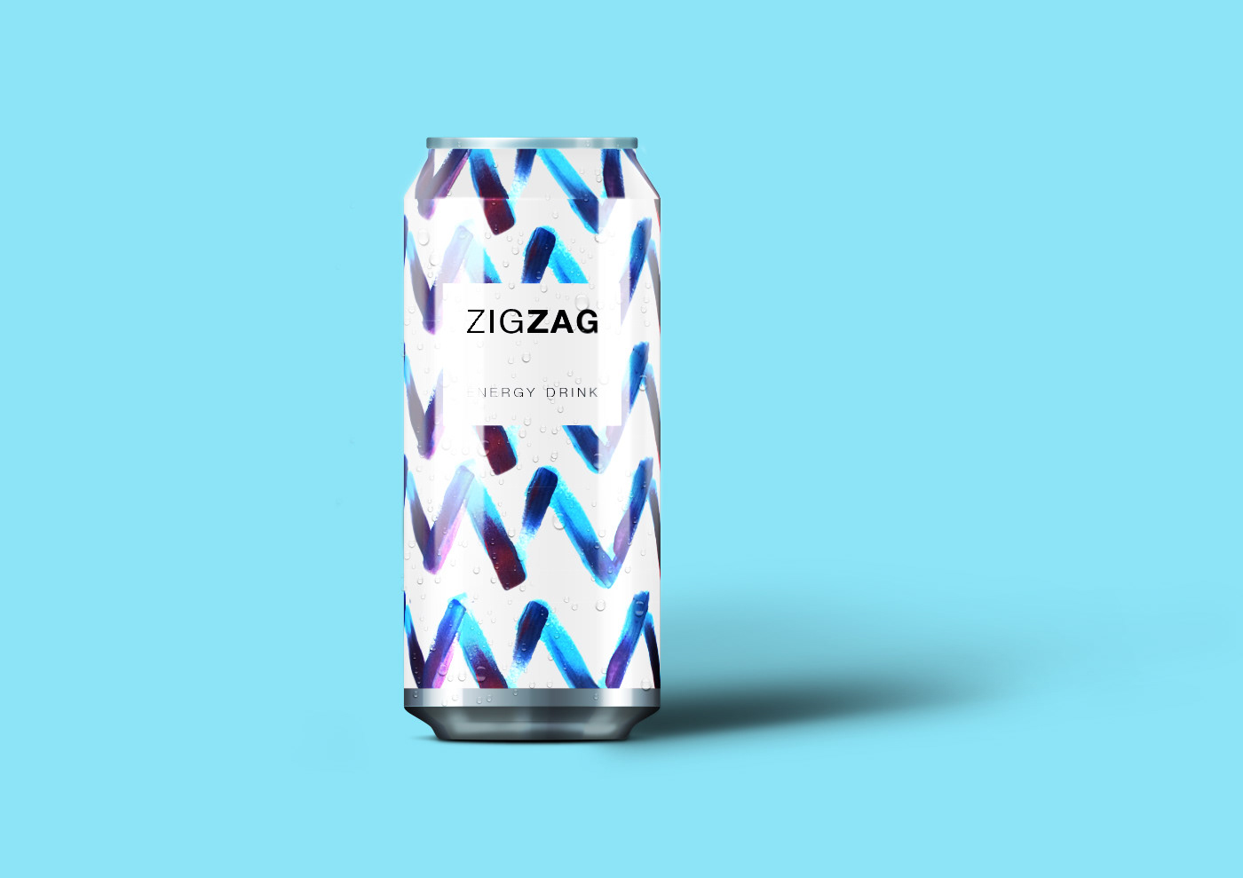
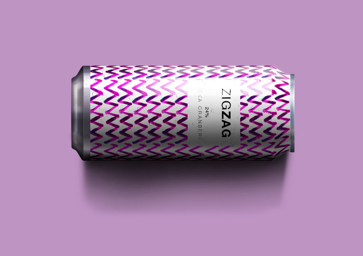
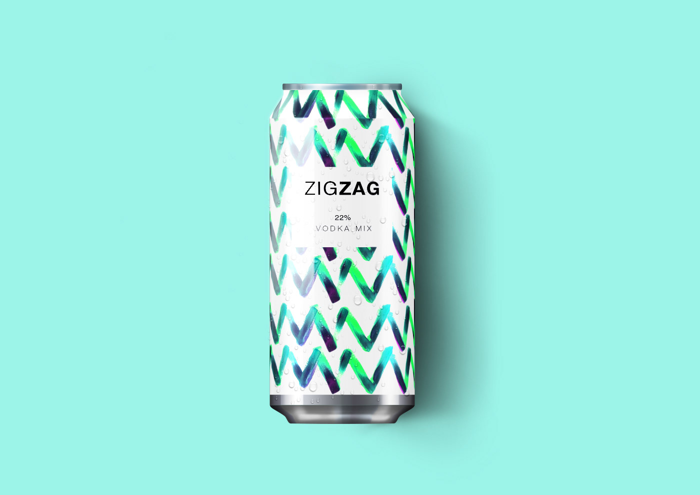
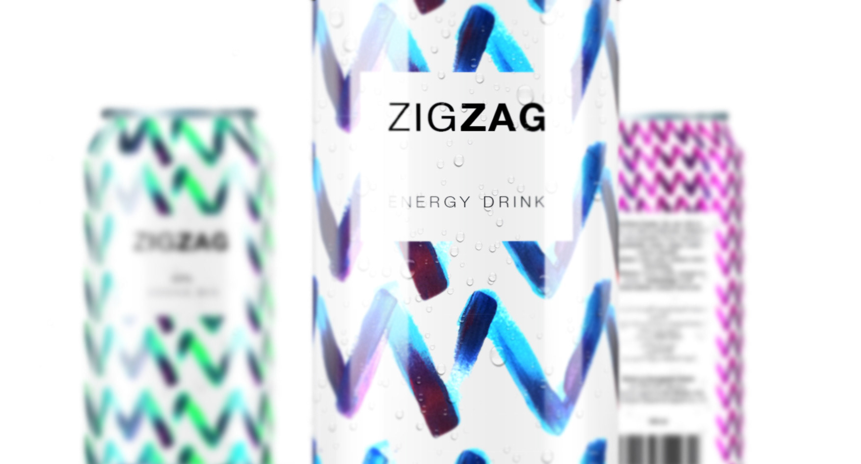
Overview: Zigzag is a refreshing alcoholic energy drink available in three distinct flavors, positioned as a smooth choice for any event. Competing in a saturated market, the client wanted a fresh and exciting redesign for their cans — something that would stand out on shelves and communicate the brand’s lively, modern personality. I was commissioned to create a packaging concept that balanced artistic creativity with commercial appeal.
My role: Lead Designer — packaging concept, illustration, color exploration, production-ready artwork.
Challenge: The existing packaging lacked the visual punch needed to compete in the full-strength energy drink space. The challenge was to create a design that was both dynamic and premium, with enough versatility to work across three unique flavor variants while still feeling cohesive as a product family.
Approach: I began by exploring bold, energetic visual languages and experimenting with color and texture. Using physical paintbrush techniques, I hand-crafted a series of vibrant patterns, scanning and refining them digitally to suit the can format. Each flavor was given its own color story, while shared brushstroke motifs unified the range. The result was a visually striking series of cans that radiated movement and personality.
Deliverables: Three flavor-specific can designs, hand-painted pattern series, digital artwork files, and print-ready packaging layouts.
Outcome: While the client ultimately moved forward with a more restrained design direction, this concept gained recognition in the design community and was featured on Packaging of the World for its creativity and craftsmanship. It remains one of my favorite projects — a perfect blend of tactile artistry and bold commercial design.
Want to talk about packaging that turns heads? Email me — I love creating designs that make products impossible to ignore.